5 Data Visualization courses in Liverpool
Get a 10% discount on your first order when you use this promo code at checkout: MAY24BAN3X
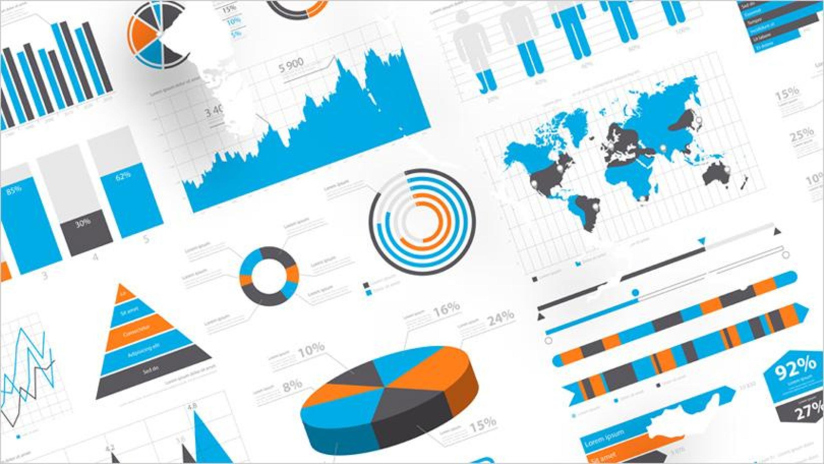
OVERVIEW -------------------------------------------------------------------------------- Data and visual analytics are emerging fields concerned with analysing, modelling, and visualizing complex high-dimensional data. It can be analysed and visualised with many languages like Python, R Programming and more. This course will help to attain the skills and give in-depth knowledge to the participant's enhanced way of modelling, analysing and visualizing techniques. The course will highlight practical challenges including composite real-world data and will also comprise several practical studies
Data Analysis and Visualization with Microsoft Excel
By Mpi Learning - Professional Learning And Development Provider
This course is designed for students who already have foundational knowledge and skills in Excel and who wish to perform robust and advanced data and statistical analysis with Microsoft Excel using PivotTables, use tools such as Power Pivot and the Data Analysis ToolPak to analyze data and visualize data and insights using advanced visualizations in charts and dashboards in Excel.

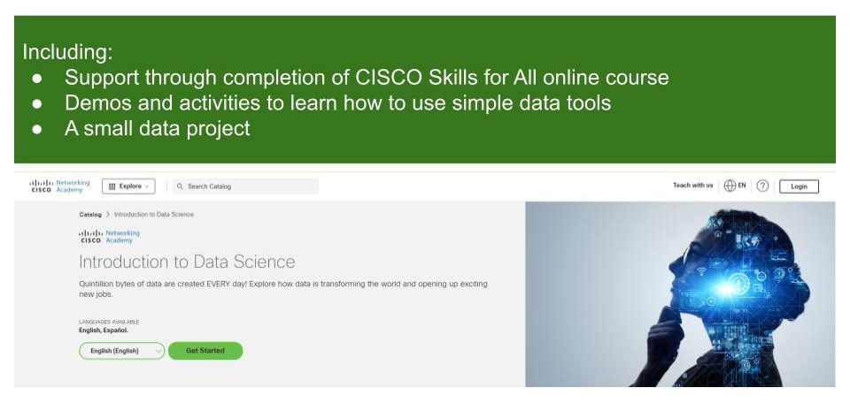
Introduction to Data Science
By futureCoders SE
Learn the basics of Data Science, combining a supported #CISCO Skills for All online course with practical learning and a project to help consolidate the learning.
Introduction to Data Science - free for Medway residents
By futureCoders SE
Learn the basics of Data Science, combining a supported #CISCO Skills for All online course with practical learning and a project to help consolidate the learning.
Power BI - dashboards (1 day) (In-House)
By The In House Training Company
Power BI is a powerful data visualisation program that allows businesses to monitor data, analyse trends, and make decisions. This course is designed to provide a solid understanding of the reporting side of Power BI, the dashboards, where administrators, and end users can interact with dynamic visuals that communicates information. This course focuses entirely on the creation and design of visualisations in dashboards, including a range of chart types, engaging maps, and different types of tables. Designing dashboards with KPI's (key performance indicators), heatmaps, flowcharts, sparklines, and compare multiple variables with trendlines. This one-day programme focuses entirely on creating dashboards, by using the many visualisation tools available in Power BI. You will learn to build dynamic, user-friendly interfaces in both Power BI Desktop and Power BI Service. 1 INTRODUCTION * Power BI ecosystem * Things to keep in mind * Selecting dashboard colours * Importing visuals into Power BI * Data sources for your analysis * Joining tables in Power BI 2 WORKING WITH DATA * Utilising a report theme * Table visuals * Matrix visuals * Drilling into hierarchies * Applying static filters * Group numbers with lists * Group numbers with bins 3 CREATING VISUALS * Heatmaps in Power BI * Visualising time-intelligence trends * Ranking categorical totals * Comparing proportions * View trends with sparklines 4 COMPARING VARIABLES * Insert key performance indicators (KPI) * Visualising trendlines as KPI * Forecasting with trendlines * Visualising flows with Sankey diagrams * Creating a scatter plot 5 MAPPING OPTIONS * Map visuals * Using a filled map * Mapping with latitude and longitude * Mapping with ArcGIS or ESRI 6 CREATING DASHBOARDS * High-level dashboard * Migration analysis dashboard * Adding slicers for filtering * Promote interaction with nudge prompts * Searching the dashboard with a slicer * Creating dynamic labels * Highlighting key points on the dashboard * Customised visualisation tooltips * Syncing slicers across pages 7 SHARING DASHBOARDS * Setting up and formatting phone views * Exporting data * Creating PDF files * Uploading to the cloud * Share dashboards in SharePoint online